Parsons’ Master of Science in Data Visualization (MSDV) program includes curriculum work with information aesthetics, data visualization and data structures using a variety of modern technical tools.
These projects explore the role of data in resilience planning using javascript and html to map time, space and quantities from the lens of emergency planning and responses.
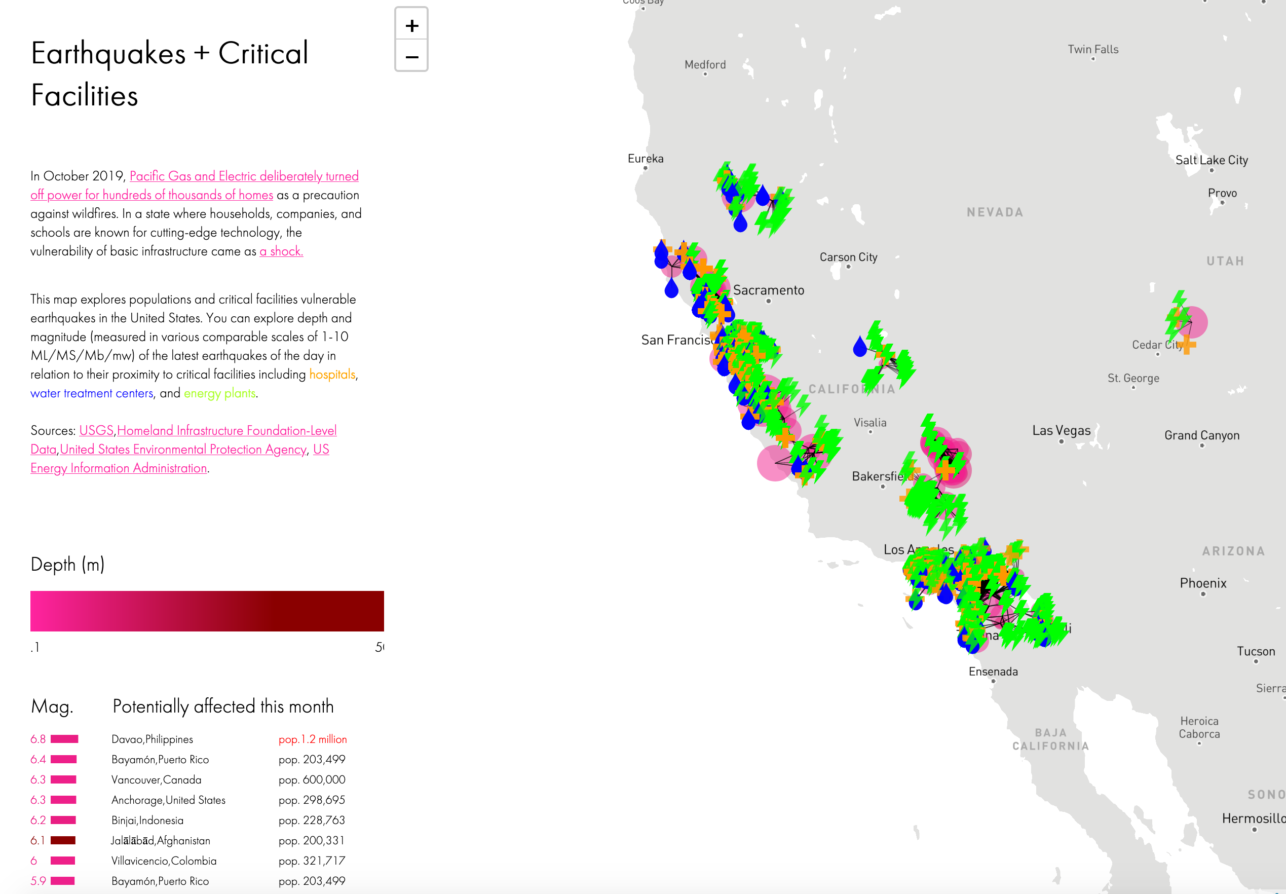
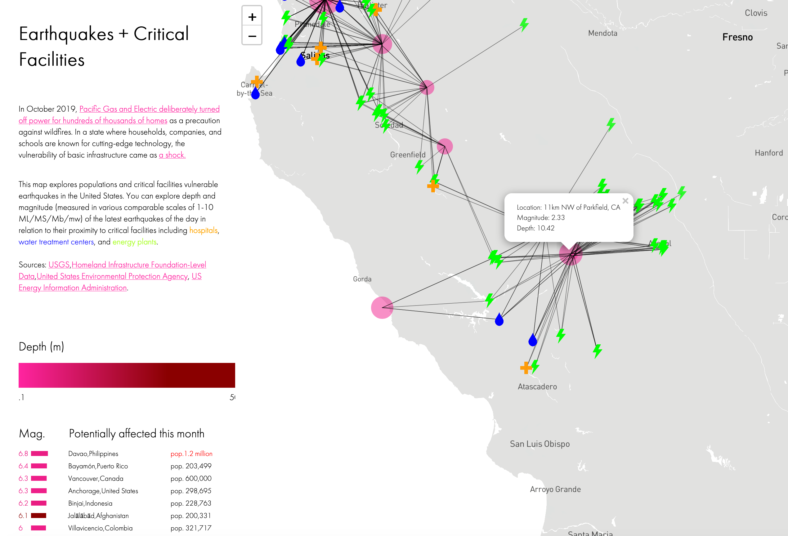
The interactive map displays the location of emergency facilities in relation to their proximity to earthquakes, displayed by depth and magnitude of the earthquake. To create this interactive tool, I aggregated the locations of hospitals, energy plants, and water treatment facilities from government sources and mapped their proximity to USGS significant earthquake data.
I used d3.js, leaflet.js. p5.js, and brewer.js for the styling and interactions.
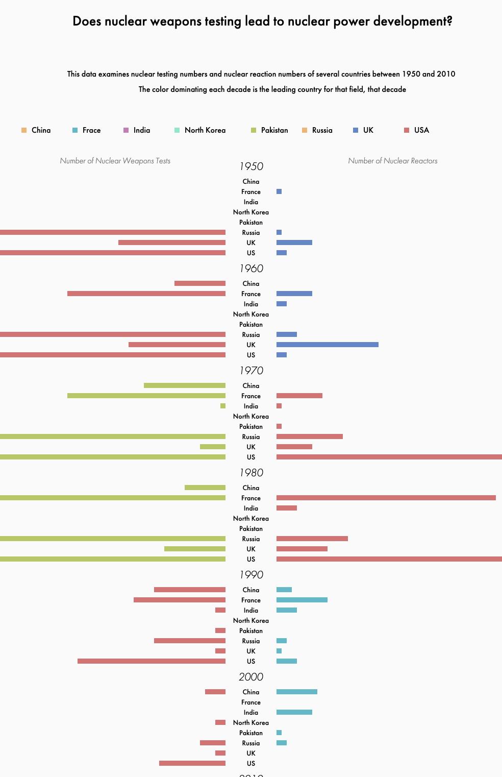
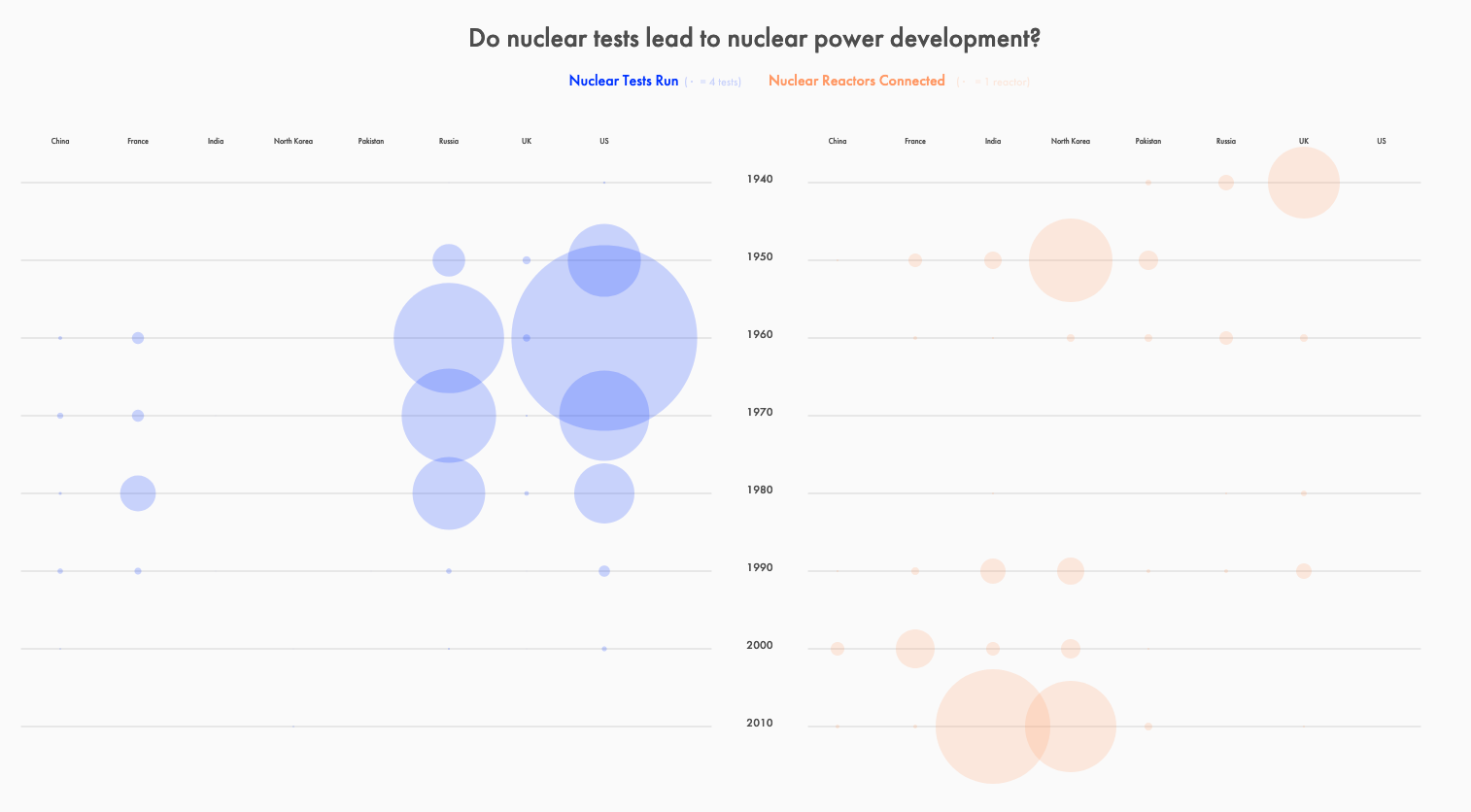
The exploration of nuclear testing and energy consumption data was an exercise in converting data tables to JSON and CSV data, and used tools such as Tableau and Excel to help identify data patterns in sketching out various data breakdowns.

I compared nuclear testing types and frequency by countries over time to their consumption of nuclear energy and hydro energy to find insights on who was conducting largest amount of nuclear testing for which potential purposes.
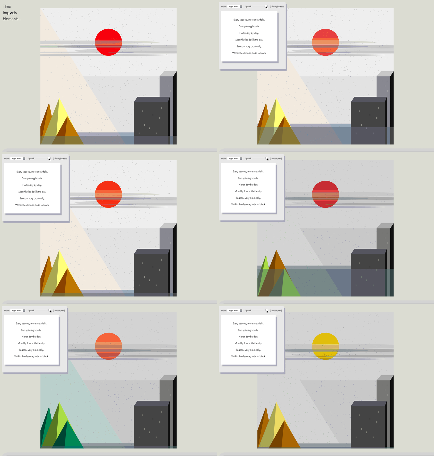
This countdown clock maps time in relation to seconds, hours, and days to p5.js elements in order to visualize a countdown of the impacts of climate catastrophe.
This experimental piece was an exercising in working with javascript to map live elements to data feeds, and incorporated a cryptic legend explaining the time mapping:
	  Every second, more snow falls.
	  Sun spinning hourly:
	  Hotter day by day.
	  Monthly floods fills the city.
	  Seasons vary drastically.
	  Within the decade, fade to black